
 The financial media is flooded with commentary questioning whether the current rise in stock indexes is sustainable enough to mark the beginning of a new bull market. In short, have we gotten out of the woods, or are we in a clearing with more uncertainty to come?
There are many angles through which this stock market environment can be interpreted. Here, we’ll focus on a set of StockCharts Market Summary tools that provide insight by way of comparative performance: in short, using ratios to evaluate the qualitative dimensions of stock market participation.
This article is based on a simple market axiom: bull markets typically don’t thrive on defensive sectors. Bull markets reflect confidence in long-term growth prospects. Defensive sectors, in contrast, are where investors run to when they’re not confident about the economy.
Key Offense vs. Defense Ratios to Watch Right Now
With that said, let’s look at the Market Summary’s Key Ratios > Offense vs Defense panel. Here are the main ratios:
- Discretionary vs. Staples. Consumer Discretionary Select Sector SPDR Fund vs. Consumer Staples Select Sector SPDR Fund (XLY:XLP). This ratio reflects where investors believe consumers are likely to spend; toward discretionary items like entertainment, or toward essential goods like food and household products. Since consumer spending accounts for roughly 70% of U.S. GDP, this makes the XLY:XLP ratio a valuable indicator of broader economic sentiment.
- Technology vs. Utilities. Select Sector SPDR Fund vs. Utilities Select Sector SPDR Fund (XLK:XLU). This ratio tracks whether investors are leaning into a risk-on preference for growth and a low-rate environment, or leaning into a more defensive posture, where utilities tend to outperform.
- Biotech vs. Health Care. SPDR S&P Biotech ETF vs Health Care Select Sector SPDR Fund (XBI:XLV). This ratio highlights the difference between speculative risk-on vs risk-off. Biotech is among the most speculative and riskiest industries within all 11 sectors.
- Hotels vs. Utilities. Dow Jones US Hotels Index vs Dow Jones US Utilities Index ($DJUSLG:$DJUSUT). This ratio compares cyclical, consumer-driven hotel stocks (a classic risk-on sector) with defensive, recession-resistant utilities.
This chart lays it all out:
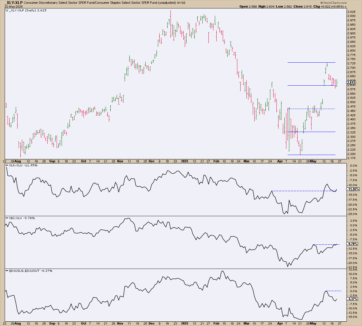
FIGURE 1. CHART OF MARKET SUMMARY RATIO LIST. All of the ratios are in alignment, with a tilt toward a risk-on posture.
XLY:XLP is pulling back from a steep recovery. The Quadrant Lines gauge the strength/weakness of the ratio’s retracement. If the decline stays within the first top two quadrants, then the case for a risk-on recovery within this segment of consumer spending becomes more evident.
As for the other ratios, note the relation of price to near-term resistance (see blue dotted line). Like XLY:XLP, hotel spending vs. utilities appears poised for a breakout, so watch this space closely.
To stretch the Dow Theory tenet that stock indexes must confirm each other, you can also transfer that idea to the domain of offense vs defense indexes. The XBI:XLV ratio has already broken above the spread’s near-term resistance, suggesting that risk-on may be a go; even moreso tech vs. utilities (XLK:XLU).
Discretionary Stocks in Focus: Can XLY Hold the Line?
Since spending plays a clear and immediate role in GDP calculations, the focus will be on discretionary vs. staples spending. In light of this, take a look at this daily chart of XLY.
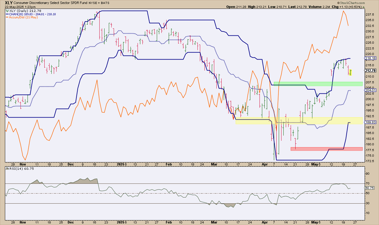
FIGURE 2. DAILY CHART OF XLY. Discretionary stocks are pulling back after an impressive run capped off by a strong runaway gap.
XLY is pulling back slightly after a sharp gap up, having recently hit a local high near $218. Combined with Price Channels to highlight swing highs and lows, the green-shaded area marks the breakout range. While this zone may offer some support, don’t be surprised if XLY retraces further.
A more favorable and (historically) resilient support level lies in the yellow-shaded range between $189 and $192. A drop below this zone would signal further weakness, despite the presence of additional support around $177, shaded in red.
- Momentum-wise, the Relative Strength Index (RSI) is oscillating just below the 70 level, suggesting there’s still room for an upward move before entering overbought territory.
- Volume-wise, the Accumulation/Distribution Line (ADL), overlaid above the price chart, indicates strong accumulation, a bullish signal reflecting sustained buying pressure.
Staples Show Weak Momentum: What XLP’s Flatline Means
Now, let’s compare this to XLP which, at a glance, is both volatile and flat. Here’s a daily chart.
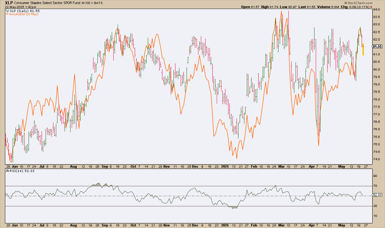
FIGURE 3. DAILY CHART OF XLP. Staples may be performing relatively well, but there’s no overarching trend in sight.
Over the last year, the secondary trends show a series of bullish/bearish back-and-forth movements, but, cumulatively, there’s no indication that XLP is poised for a major breakout to the upside. XLP may present a favorable market for swing traders looking to fade short-term tops and bottoms, but as for long-term growth, there’s little evidence for a bullish or bearish case.
- Momentum-wise, the RSI is more or less flat, hovering at the 50-line with no real directional movement.
- Momentum-wise, the ADL shows accumulation and distribution on par with the price movement. There’s nothing to suggest that XLP is experiencing any degree of buying or selling pressure to push the price higher or lower.
How to Apply These Ratios to Your Market Outlook
Confirm the broader narrative. If you believe the broader market is poised to move beyond recovery, then the ratios, all of which favor a risk-on posture, should serve as a tentative green light.
Furthermore, use pullbacks to assess investor conviction. Volume and momentum-based indicators can help you gauge whether there’s real conviction behind the swing. Other indicators you can use to gauge the broad market indexes are all featured in my article on Dow Theory.
At the Close: Are These Ratios Signaling a Real Market Shift?
If these risk-on ratios continue to hold or break higher, they may offer early confirmation that this market isn’t just bouncing, but rather building. Remember that defensive sectors don’t lead bull markets. So far, the offense is making a compelling case; monitor the ratios from the Market Summary page to help guide you through the market’s uncertain environment.

Disclaimer: This blog is for educational purposes only and should not be construed as financial advice. The ideas and strategies should never be used without first assessing your personal and financial situation, or without consulting a financial professional.